Common ground between two kinds of designers
Maybe there are fewer buckets of water and hours spent trimming stems, but interactive design has the same guts as floral design. Florists and web designers might be different kinds of people, work in different environments, with different tools, but they’re beholden to the same creative rules of engagement.

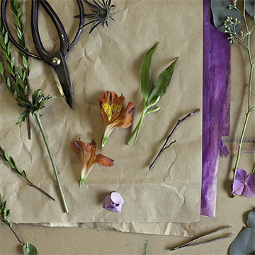
I recently had the chance to work as an assistant to a crazy talented floral designer—and I came away swimming in a new vastness of flora knowledge, an appreciation for the sheer muscle involved, and very sore feet. I also came away thinking about how design is design, while the medium may change, the challenges are the same.
First of all, it’s a hell of a lot more work than you think it is. We can spend 3 weeks on a logo, I’m talking 120hrs, and we’ll get it right. But it takes time, many reviews, brainstorms, print outs, sharpies and perspectives. Flowers do too. All of it. Floral designers do get to do all the romantic things we think about: observe color, texture and shape, watch the way a stem moves and know how to place it just so… but they also have to know which stems will bow over time, and to place them where they have support from their fellow flora. They must know what temperature to maintain their product at in order to slow the blooming until the arrangement’s moment in the limelight, how long you can handle flowers before the heat from your hands expedite their wilting, and that hydrangeas need a vertical cut at the tip of their stem to help them drink. They need to be able to anticipate what variety of blooms they’ll have in any given month of the year, how to design in their head and write recipes for their clients, how to build budgets, and how to keep their designs contextually appropriate. As my father would say, “nothing is as easy as it seems.” Amen Pops.

We have a rule around the design shop, “Concept is king.” I’d argue context is queen and you must have the pair to rule.

Design without concept is bound for failure. Without purpose and a user with needs driving design, we end up with masturbatory design that exists for its own sake.Dare I get philosophical and claim that this is the distinction between design and art—design serves a function beautifully, while art is not beholden to this rule. There we have the king of good design, but let’s not forget the almighty queen: design that fails to consider context cannot possibly serve its user. We’ve all seen print design try and be interactive design, it looks damn fine, but does jack for the user.
Floral design must serve its user and be contextually appropriate, too. Picture a wedding on a Washington beach were everything is sandy golden and stormy blue, then make all the flowers chartreuse and fuchsia, featuring orchids and other tropical things. You’d have an arrangement sorely out of place in its environment. Similarly, put something like daises in an architecture firm’s lobby and you’ve failed to notice what the business exists to do. Appreciate your surroundings, the purpose of being in that place (be it physical or the interwebs), and your work will do much more for its user.
We have a rule around the design shop, “Concept is king.” I’d argue context is queen and you must have the pair to rule.tweet this

Of course, all this king-concept and queen-context jazz is incredibly tough. It takes mastery of craft, creative intuition, and mucho observation. And smarts, let’s not skimp on smarts. I mean the ability to have a style, and to set that style aside in exchange for your client’s taste and needs. They may want a monochrome, Barbie pink design—and well, that’s just the creek you’re up without a paddle. But the smart designer is not stuck, they know when and where to weave in their own aesthetic, how to make a bad idea good, and how to design for their client, business, user, environment, budget and timeline. Designers, no matter the discipline, are only great when they can design for their customer, and still knock our socks off.
Finally, my adventure as a floral assistant reminded me of one rule that goes too often unspoken. Beauty. Sometimes that word gets a bad rap, being (among other things) “only skin deep,” or “in the eye of the beholder” or always fleeting. Yea, all those are true (I dunno about the skin deep bit), but it’s still one of the common traits of humanity: we are moved by beauty. Yes, we must reinforce business goals with design, serve the user, be contextually appropriate, and yes we must meet client needs and budgets—good design does all this and allows us so succumb to the sheer enjoyment of gazing at a beautiful thing. Maybe I’ll petition the studio to revise our rule: concept is king, context is queen, and beauty makes our hearts beat.
My short stint in floral design taught me lessons every producer should take time to learn: I have more respect and patience for the designers on my team, they are juggling complicated goals and it’s more difficult than meets the eye. I may now have higher expectations of our studio’s work and a more firm understanding of what successful design looks like, but I won’t forget about all the blood, sweat and pixels it takes, or my sore feet.

