Logos are important.
Once I was asked by a client, “What is your favorite thing to design?”
Without hesitation, I replied, “Designing a logo.”
He said, “That’s one of the hardest things to design for because you have to distill an entire brand into just a few letters and a symbol.”
Exactly. The challenge and weight of a logo’s importance to a business are why I like designing them. The essence of logos are part of the reason why people form deep emotional attachments with a brand. To them, the logo becomes the brand at a personal level, especially when they have long-standing positive interactions with it.

Remember when Gap did a logo redesign? It caused quite a stir, appearing on prime-time news. That’s usually when design makes it in the news, a logo change. There are many things a logo represents to people based on their experiences with the brand, and they are marked by the logo, the visual representation of the brand that gets seared into their psyches.
That’s why people put so much weight into the logo. It’s the symbol of the company, and regularly confused as the brand that it represents because it represents all their cumulative experiences with it.
At it’s most basic function, a logo’s job is to identify. It’s a flag that visually marks a company, organization or product. It’s up to the company to create and build meaning around what the logo symbolizes and holds. It’s this importance that makes designing and the distilling it into a great logo so enjoyable.
Whether you’re designing a logo or judging its effectiveness, there are three key characteristics that define great logos.
1. Great logos are conceptual.
First, a great logo has a concept behind it, you can see a clear idea. This can be manifested with a twist of a common idea in it’s category.


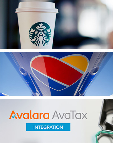
Or it can be something not used in the category or says what it is or does, for example, the Starbucks mermaid logo.
In it’s most ideal form, the concept of the logo encapsulates the key idea of a company’s positioning or big idea. This will help to underscore a company’s promise to its audiences.
An example is Southwest Airlines new logo. It represents their promise of “we put our hearts into every flight.”
Another example is Avalara, a startup that helps their customers with all their compliance needs. A checkmark reinforces that you can trust Avalara to check compliance off the list for you.
The logo is the symbol of a company, and regularly confused as 'the brand' because it represents a customer's cumulative experiences.tweet this
2. Great logos are timeless
A logo is used the longest of any visual asset of a brand, so it has to work hard for many years. To make a logo classic, it needs to be simple so it can stand the test of time.
Clean lines and uncluttered composition help to create a timeless design. Trendy techniques of the day will make it feel out of date.


3. Great logos are adaptable
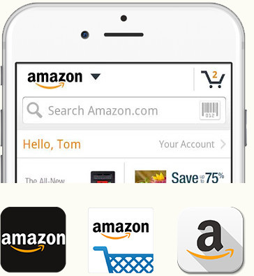
With today’s multi-device and multi-size applications, a logo needs to work harder than ever in size and scope. It must be adaptable and retain meaning everywhere from browser navigation bars to app icons to social media avatars, packaging, and even to sides of buildings.
Lastly, a logo also must work at one color. There are those times when you will do a newspaper ad or fax a document.

I’m like everyone else, logos are personal to me, too. Maybe exponentially more. I’m attached to every client’s logo I had a hand in creating because I know the importance emotionally and business-wise of what the logo represents for our clients. It’s gotta be great and every detail counts. It’s highly crafted and nuanced down to minutiae, as well as highly visible and experience by so many people.
As you can imagine, it’s a big challenge to both create and sell a new logo to an internal team of a stakeholders. If you keep this criteria in mind as you move through the development of a logo, you will bring to life a logo that functions as well as it is memorable.
