b. The Website
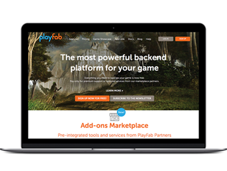
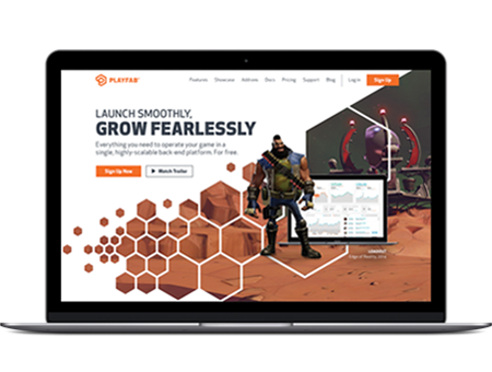
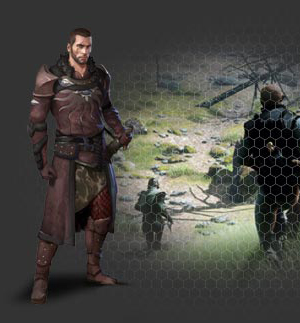
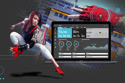
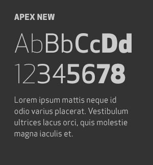
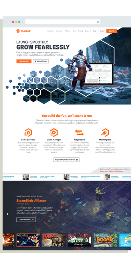
Of course, since this was a full rebrand the website had to take center stage. We referred to the original visual identity to inform our treatment of imagery, custom CSS elements, typography and iconography.
For the UI, we needed to design the pages to balance dense information with ease of navigation for two distinct audiences — Engineers and Game Operators.
After wireframing, this was our process:
- We deliberately applied design one page at a time, checking to make sure our navigation wasn’t getting cluttered.
- We distilled the product down to its four most basic elements (Game Services, Game Manager, PlayStream and Marketplace), then branched out to the rest of the features.
- We kept the two core audiences top of mind by structuring the page layout with a summary section first (for the Game Operators)and then offering a more thorough checklist for the Engineers.
The Role of Brand Strategy
When the project pivoted, we were halfway through the brand strategy research phase. This meant that our position and messaging were not final.
Because we had to start designing and writing the website, we made the decision to flip the order of operations and start with sub-pages, working from the bottom up toward the home page. By the time we were ready to architect the homepage we had a clear focus for the messaging.
